YouTube has a new interface, and not everyone is excited about it
Following a significant overhaul last year, it appears that YouTube may be undertaking another visual transformation, this time targeting the video page, which has remained relatively unchanged in recent years.
The change was noticed and posted on Twitter by @XenoPanther.
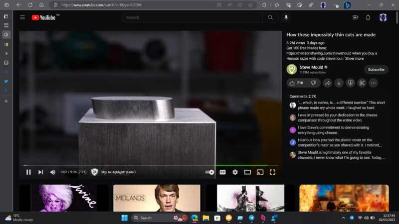
The new design. At present, the web-based video page features a video window accompanied by the title and other details/descriptions displayed below it. However, with the redesign witnessed by a select few over recent weeks, this information is now situated to the right of the video and appears much narrower. Buttons for likes, dislikes, sharing, and more are located underneath, along with a selection of five or so recent comments.
This creates an interface that closely resembles a mobile layout. Consequently, the “Up Next” videos and additional recommendations no longer appear on the right edge of the screen. Instead, they are presented in a grid at the bottom, mirroring the appearance of the YouTube homepage. Users might even encounter a “Latest YouTube posts” section while scrolling.

While the experience of watching a video remains largely unaffected, the relocation of comments and other details to the periphery constitutes a significant change in the interface. It is evident that the redesign’s primary objective is to emphasize other videos for viewers to watch, using much larger thumbnails. This provides a more relaxed viewing experience, although it remains uncertain whether the redesign strikes the right balance between information, comments, and recommendations.
Not everyone is thrilled. The angriest comment comes from u/Psyren1317, who replied “Holy hell is this new layout disastrous,” before saying “Whoever designed this mess should be fired. Yikes.”
Redditor u/DaGrumpyOne lived up to their username, replying “It’s unusable now.” While u/texaslegrefugee decried the change saying “The entire “library” experience is absolutely terrible. It’s as over-designed as it can get, and nothing but confusing chaos. It takes forever to find anything.”
“Yo @YouTube The new video UI layout is absolutely awful. The massive thumbnails from other videos on the bottom of my screen are so distracting. Literally, no one asked for this.”
Why we care. Naturally, any modifications to the interface can potentially influence watch time and user engagement, ideally in a positive manner. Advertisers should be concerned about these changes because an enhanced viewing experience, which encourages users to spend more time on the platform, could lead to increased ad impressions and higher chances of their advertisements being seen by their target audience. Consequently, a well-balanced and captivating interface that seamlessly integrates information, comments, and recommendations can prove advantageous for advertisers, as it can potentially amplify their reach and impact on viewers.
The post YouTube has a new interface, and not everyone is excited about it appeared first on Search Engine Land.


Recent Comments