
How to use Google’s Channel Performance report for PMax campaigns

For years, PPC advertisers have considered Performance Max (and Smart Shopping before it) to be a black box, even a black hole.
While its powerful automation drives convincing results, the lack of transparency into channel performance has been a persistent frustration.
Now, Google is beginning to provide some answers.
The rollout of the new Channel Performance report marks a significant step toward the transparency advertisers have been demanding.
This guide explains what the report is, highlights its strengths and weaknesses, and shows you how to use it.
What is the Channel Performance report – and why is it a big deal?
The Channel Performance report is essentially a pre-built network report (we can discuss the semantics of channel versus network another day), which can be found under Campaigns > Insights and Reports > Channel Performance (beta).
It offers tabular network data and an interactive flow diagram from impressions down through conversions.
The Channel Performance report only works for Performance Max campaigns. However, credible clues suggest that this report may support additional campaign types in the future.
This is important because, while Performance Max is (in)famously a “channel soup,” all campaign types are capable of serving across different ad networks within Google’s grasp, and many of them do so by default.
Previously, untangling this mix to see which channels were actually performing was a task left to manual reports or, in the case of PMax, third-party scripts based on guesswork.
The Channel Performance report is Google’s native solution.
A tour of the Channel Performance report
The report is composed of two main elements:
- An account-level view that offers a compact summary of each campaign’s channel data (plus some hidden features).
- A campaign-level view that offers a neat but, in my opinion, deeply flawed Sankey diagram, and another data table, more detailed than at the account level.
Furthermore, there are various customization options, which can be saved as preferred views, and multiple export options.
1. The account-level overview: Channel data in the palm of your hand
The account view is a newer addition to the Channel Performance report, and in some ways my favorite view.
Previously, when you accessed this report, you’d land on a blank page prompting you to select an individual Performance Max campaign.
Now, this handy table is the first thing you’ll see.

It has a series of rows for each campaign, nested rows for each channel, and columns for the performance metrics.
One thing I love is that each nested row has the channel icon next to it.
Tabular data can sometimes make my eyes cross, but this simple visual aid makes the data much easier to skim.
By default, the campaign rows are sorted alphabetically, and you’ll likely want to sort by something more practical, like impressions, costs, revenue, etc.
After that, you can really leap down the page easily, comparing the distribution of your key campaigns.
But that’s the obvious part.
My top tip for this view is that you can change your segment, and among the options, two really stand out for me:
- Ads using product data.
- Ad event type (under Segment > Conversions).

The first allows you to see the volume and performance of “ads using product data” (feed-based ads) versus “ads not using product data” (asset-based ads).
Yes, that’s right, finally a simple comparison of feed ads and asset ads. Besides network performance, this has been one of the most contentious and least transparent areas in PMax, prompting numerous advertisers to run so-called “feed-only” PMax campaigns.
Now you can easily see what’s going on with this performance facet across all your PMax campaigns, plus an account-level summary row at the bottom.
Whether you like or dislike what you’re seeing, you can head over to your asset-group-level and asset-level reporting to dig deeper.
Be cautious when judging the performance of asset-based ads. They should not be held to the same efficiency standards.
The second segment, ad event type, might sound non-descript, but it’s really important.
It lets you easily understand the volume and performance of your click-through versus view-through conversions.
This has been (yet another) divisive topic in PMax:
- Do view-based conversions belong mixed together with standard conversions?
- Does this inflate performance?
Now you can answer these questions per campaign and also at the account view in the summary row.
But what if you want even more detail?
What if, for example, you want to learn your feed versus asset share in, say, YouTube specifically?
That’s not possible at the account level, but it certainly is at the campaign level.
Just click on any campaign and it will load a new page drilling down to the next reporting level.
2. The campaign-level view: Data visualization and detailed analysis
The first thing you’ll notice on this page is the large Sankey diagram.
It’s visually striking and has become a signature of the Channel Performance report.
That said, we need to set it aside for now. Scroll down to the data table below, which is similar to the one you just saw.
The campaign data table: A deeper dive
While the Sankey diagram gives a high-level view, the table below is where real analysis happens.
It’s more reliable for decision-making because it shows the raw numbers without visual distortion.
The table breaks performance down by channel and ad type – the feed-based versus asset-based split we discussed earlier.
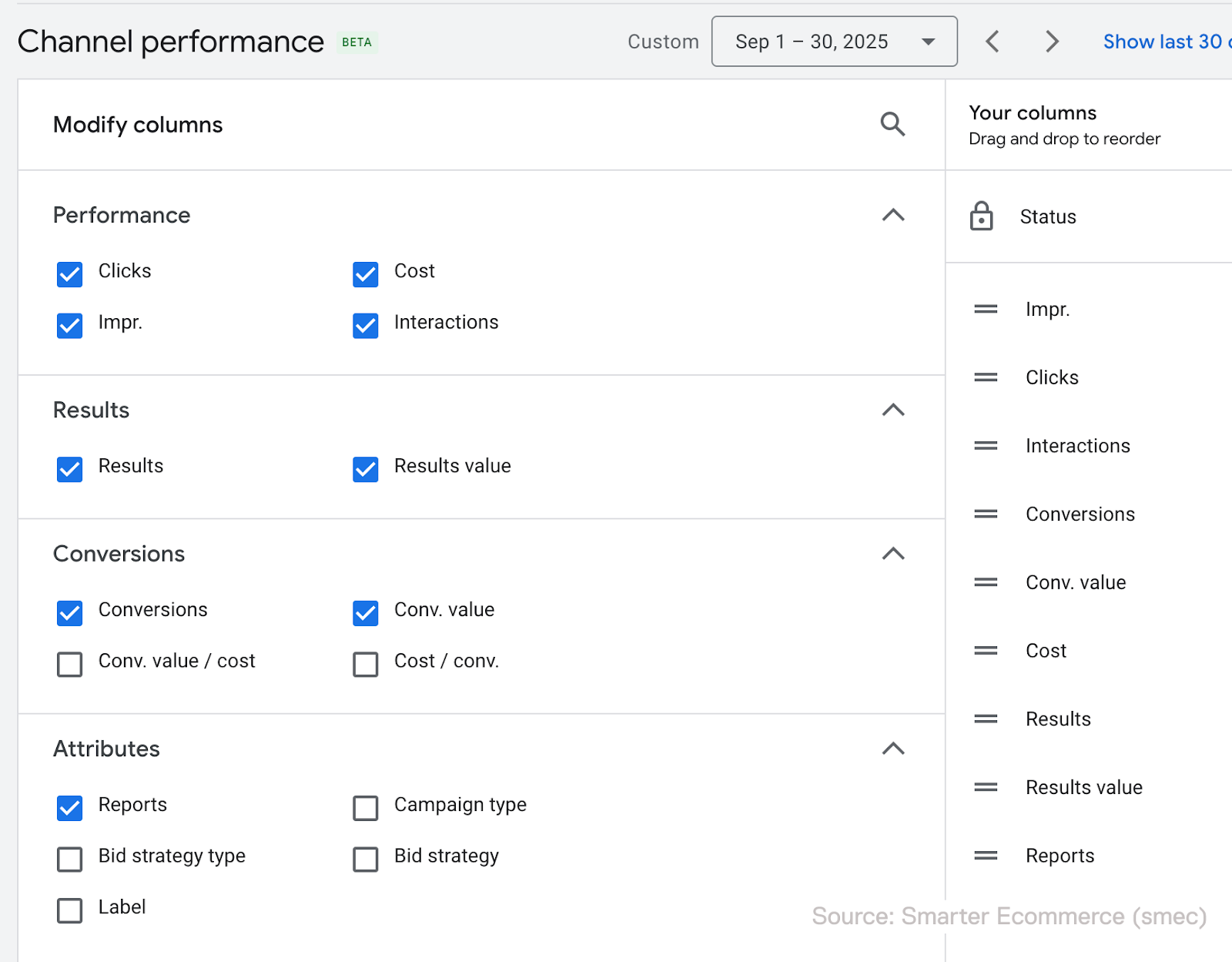
For each segment, you can review multiple metrics by default, but my top tip is to go to Columns > Conversions.
There, you can select Conv. value / Cost (a.k.a. ROAS) and Cost / Conv. (a.k.a. CPA).
These are hidden by default, but you can indeed see them, and I don’t think I have to tell you why they are interesting to know.
Crucially, the table also includes an export function, plus scheduling options, allowing you to pull the raw data for deeper analysis in a spreadsheet.
The Sankey diagram: Visualizing the flow
As noted earlier, this visualization – officially called the Channels-to-Goals chart – is visually striking, but it has limitations.
Before addressing those issues, let’s clarify its purpose and what it can tell us.
The Sankey diagram presents a visual breakdown of performance across the channels within your PMax campaign.

It maps the customer journey within your campaign – how users move from seeing an ad (impressions) to clicking or engaging with it (interactions), and, ultimately, to converting (results or conversions).
This is great. For the first time, advertisers can see the flow of core funnel metrics right in Google Ads, all segmented by the specific channel driving the traffic.
This allows you to understand how PMax allocates your budget and which parts of its vast inventory are actually working for you.
Decoding the channels
People often look at the Sankey and get stuck. “Where’s my Shopping data?” is probably the single biggest example of this.
As we’ve discussed, a key feature of the report is how it segments ads into feed-based and asset-based ads.
When we combine that dimension with the network or “channel” dimension, we can translate the labels into more familiar terms:
- Search
- Ads using product data: These are your Shopping ads.
- Other ads: This represents your Dynamic Search Ads (DSA) and Responsive Search Ads (RSA) traffic.
- Display
- Ads using product data: These are Dynamic Product Ads, which in my assessment is likely a lot of Dynamic Remarketing and some Dynamic Prospecting.
- Other ads: These are your standard Responsive Display ads.

These are my interpretations of the data, which might not be perfect.
It would be extremely helpful if Google offered more detailed documentation on what’s included.
For example, feed-based YouTube ads can comprise a variety of formats and placements, some of which, such as “GMC Image Shorts,” are not documented anywhere.
Google’s guidance is quite vague.
Get the newsletter search marketers rely on.
See terms.
The limitations of the native report
While a welcome addition, the report has some shortcomings.
The misleading Sankey diagram
The visual proportions of the diagram are not based on volume, which makes it extremely misleading at a glance.
A channel that appears to drive significant traffic may actually account for only a tiny share of your impressions.
In the example below, the asset-based Search ads segment appears to have a couple hundred thousand impressions, but in reality only has 4,500 impressions.
This makes the chart almost useless for quick, accurate analysis, which is the entire point of data visualization.

The lack of ratios in the data table
The data table provides useful raw data, but it lacks key calculated metrics needed for analysis, such as conversion rate and cost per click.
To see the full picture, you must export the data and do your own calculations.
This feels, to be honest, a bit petty of Google.
They could easily add these columns, but it seems they would prefer not to. Grab your calculator.
How to make the most of the report
Despite its limitations, you can still extract valuable insights into which channels deliver what.
The key is to focus on asset quality and traffic quality, because direct channel control is limited.
Analyze placement data for quality control
While the report doesn’t let you directly control channel mix, it helps you monitor traffic quality.
Use the placement reports to see exactly where your Display and YouTube ads are showing.
- Export this data into Google Sheets. Note that, frustratingly, it only contains impression data.
- Use built-in functions like
=GOOGLETRANSLATE()to understand foreign-language placements and the integrated=AI()function to help categorize domains and videos for brand safety. - Exclude low-quality or irrelevant placements or content at the account level, prioritizing bad placements that are higher in volume.
Build your own Sheets-based reporting or try scripts
Google has confirmed that API access and MCC-level reporting are coming to the Channel Performance report. I also expect this data to be supported in the Report Editor.
In the meantime, you can export the report as a .csv or send it directly to Google Sheets.
With a smart setup, these exports enable you to calculate custom metrics, build charts, apply heatmaps, and reshape the data as needed.
To help the community, I helped build a script that enhances Google’s report in several practical ways:
- Adds key metrics like conversion rate, CTR, CPC, CPM, and more.
- Applies clear, common-sense labels such as “Shopping” and “Responsive Display.”
- Includes charts with proportional visuals for more accurate interpretation.
- Cleans and parses columns to remove friction.
The script works for individual PMax campaigns, not the account-level view. I’m waiting for Google’s feature set and scripting options to stabilize before expanding the script.
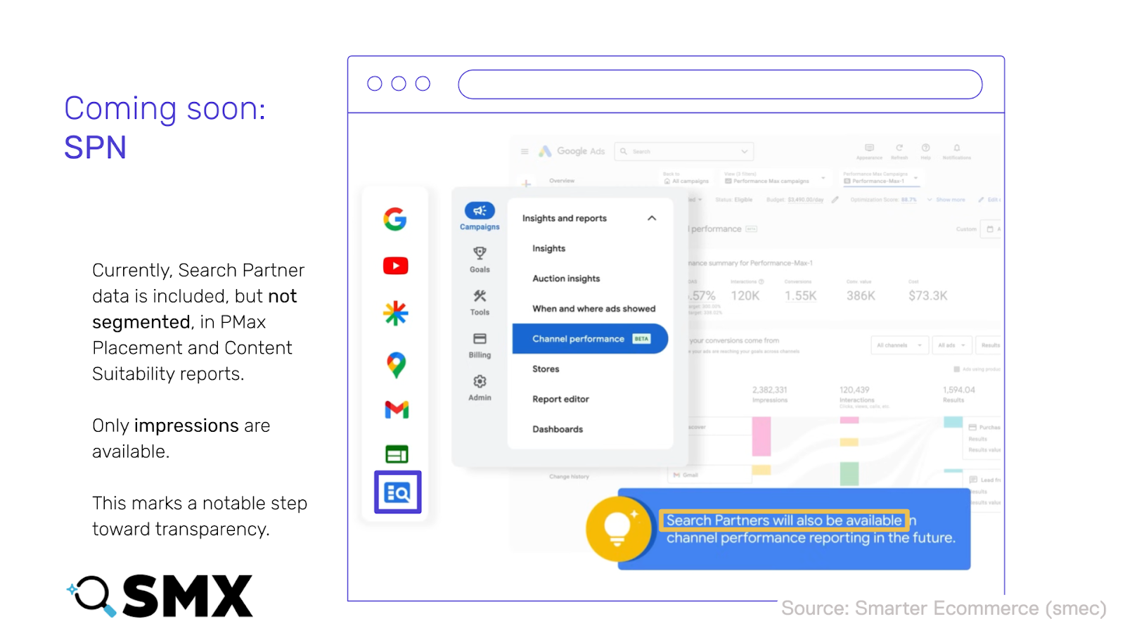
What’s next for PMax reporting?
We know Search Partner data is coming, along with API access, MCC-level reporting, and likely support for additional campaign types such as Demand Gen.
It’s encouraging to see Google share this level of detail, and there’s reason to believe this momentum will continue.
The Channel Performance report already addresses one of the most persistent criticisms of Performance Max – that it operates as a black box.
Three years ago, it would have been hard to imagine Google responding to advertiser feedback at this scale, particularly on transparency.
Still, better visibility doesn’t automatically translate into better decisions.
Interpreting this data correctly takes time, context, and careful analysis – and that work remains firmly in the hands of advertisers.


Recent Comments