
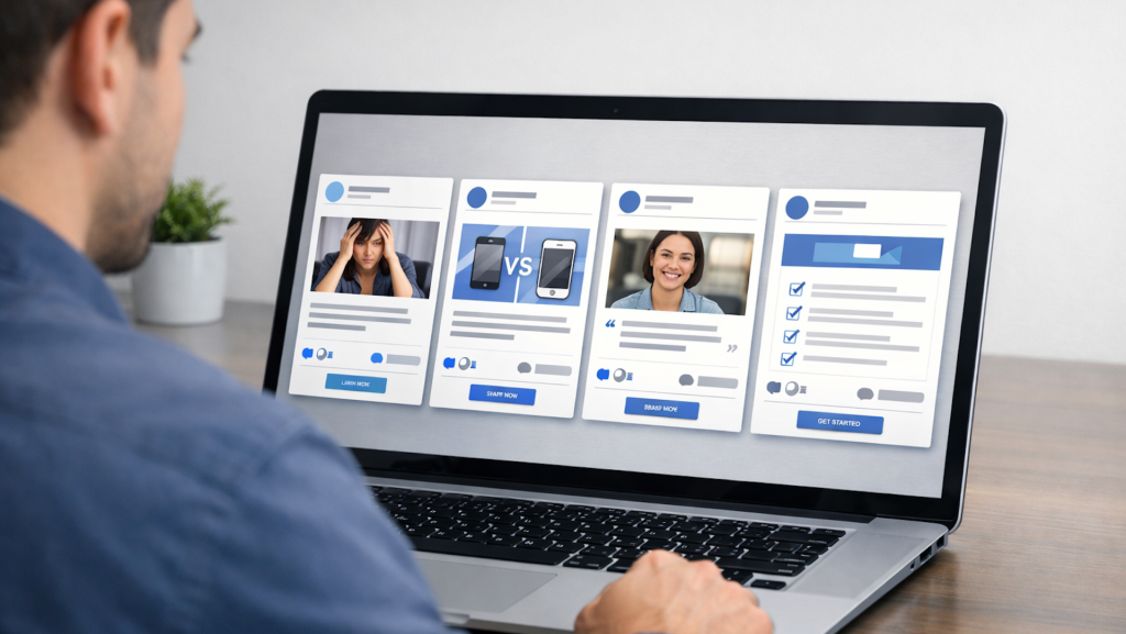
4 Facebook ad templates that still work in 2026 (with real examples)

Have you ever tried to find inspiration for ads by scrolling your own Facebook feed?
Then you know that most companies’ ads aren’t very compelling. Also, scrolling Facebook in this day and age is weirdly exhausting.
Here’s the truth: most high-performing ads in 2026 aren’t winning the day because they’re wildly original or uniquely “viral” (do we still call something that?).
They’re winning because they follow the same repeatable templates that smart marketers have been using for decades.
(Yes, even now. Even with AI. Even with “creative strategy” and words like “scrollable” being used non-ironically in business initiatives.)
This article goes back to basics, eschewing “inspiration” in favor of tried-and-true approaches.
Below are four Facebook ad templates you can use right now, regardless of what you’re selling, with real examples that show the strategy behind top brands’ creative.
1. Problem? Meet solution
Pain point → Relief → Simple next step
This is advertising 101. It worked in 1926, it works in 2026, and it’s still undefeated for a reason.
Despite what some business owners believe, customers don’t wake up thinking about your business.
They wake up thinking about their life:
- “I spent too much money.”
- “I don’t have time.”
- “I feel stuck.”
- “I’m overwhelmed.”
- “I can’t stay consistent.”
That means you’ve got to meet them where they are.
If your customer doesn’t realize their situation is solvable, they won’t buy anything.
That means, even if you’re the best solution in the world, until they recognize the problem, they won’t look for an answer.
Example: ClickUp
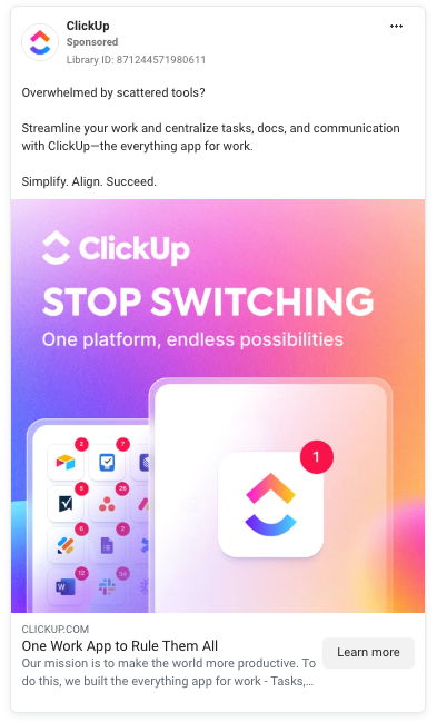
ClickUp takes a modern pain point that most tech workers struggle with on a daily basis, and reframes it into something that can actually be solved:
Overwhelmed by multiple tools and apps? Stop switching between them and use one platform that does it all.
This ad isn’t just selling “project management.” It’s selling:
- Mental relief.
- A single source of truth.
- Less context switching, more productivity.
- Team alignment.
- The promise (though some might say illusion) of control.
Plug-and-play copy starter
Still dealing with [problem]?
You’re not alone – and you don’t have to stay stuck.
[Product/service] helps you [benefit] without [common objection].
Get started → [CTA]
Dig deeper: Meta Ads for lead gen: What you need to know
2. Can your competitors do this?
Unique selling point → Instant comparison → ‘Oh, hey’ moment
If you’re in a crowded industry fighting for market share (and in 2026, a lot of businesses are), the brands that stand out are the ones that make it easy for customers to answer one question:
- Why should I choose you?
Let’s be clear: you don’t necessarily need a radical innovation or a show-stopping differentiator.
Sometimes it’s how you do things, what you prioritize, or who you’re for.
All that really matters is that you’re different in a way people can understand quickly and easily.
Example: The Woobles
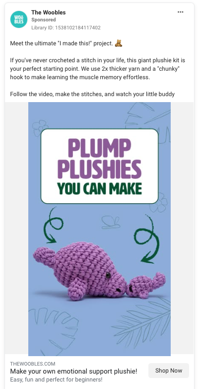
Crocheting has been around forever. Beginner kits have existed for decades. Patterns have been sold in stores since before we were all born.
And yet, somehow, The Woobles managed to grab a huge chunk of market share in a craft that’s older than the automobile.
That’s impressive.
This ad shows exactly how they do it.
Instead of positioning crochet as “learn a new skill,” they highlight what makes them different, then continue stacking their differentiators in a way that makes the purchase feel almost inevitable:
- Cute, modern projects people actually want to make.
- Designed for true beginners.
- Thicker yarn and a chunky hook.
- Step-by-step video tutorials.
That’s really the point of a strong USP ad. It’s not just “we’re unique.” It’s “here’s why this is easier, better, and faster.”
Plug-and-play copy starter
Most [category] products do [expected thing].
Ours does [unexpected/uncommon benefit].
Here’s what makes it different:
- [Differentiator 1]
- [Differentiator 2]
Try it for yourself → [CTA]
Dig deeper: Rethinking Meta Ads AI: Best practices for better results
Get the newsletter search marketers rely on.
See terms.
3. Say more with less
Testimonial/UGC → Minimal brand talk → Trust does the selling
Not every ad needs to look and sound like an ad. In fact, some of the best-performing Facebook ads in 2026 are the ones that take you a second to realize they’re sponsored.
This is the “let the customer do the talking” template, and it’s everywhere on Instagram and TikTok because it works.
Think creator-style, user-generated content (UGC), testimonials, and review-driven ads that feel real, slightly imperfect, and way less polished than traditional brand messaging.
Oddly enough, the lack of polish is part of the appeal. It reads as “honest,” not “salesy.”
Example: Allbirds
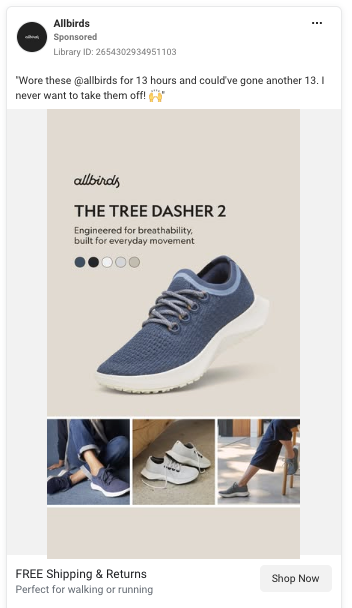
Allbirds runs a simple, product-focused ad for the Tree Dasher 2, pairing a customer quote with a simple image of the shoe.
- “Wore these @allbirds for 13 hours and could’ve gone another 13. I never want to take them off.”
That line pretty much does all the work for the ad.
It implies:
- Comfort that lasts all day.
- No break-in period.
- Real-world wearability.
The creative itself is even straightforward: product image, a few lifestyle shots, and a clean layout. It’s not trying to be flashy, it’s trying to be believable.
Plug-and-play copy starter
“I didn’t think anything would help, but this actually worked.”
[Show the proof]
If you’re dealing with [problem], try [product] → [CTA]
Dig deeper: How to test UGC and EGC ads in Meta campaigns
4. The ‘quick win’ checklist
3-5 bullets → Easy decision → Low-friction CTA
Sometimes people don’t want a story. They want clarity.
This template works especially well on Facebook because it’s built for how people actually scroll: fast, distracted, and looking for something that solves a problem right now.
Instead of writing paragraphs, you give them a handful of “yes, I want that” benefits they can absorb in two seconds.
The “quick win” Checklist format:
- Reduces decision fatigue.
- Makes value instantly scannable.
- Highlights benefits without over-explaining.
- Works beautifully for cold audiences who don’t know your brand yet.
Example: Little Sleepies
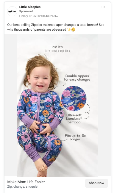
Little Sleepies uses a simple visual and benefit callouts to answer the parent question underneath the question:
- “Is this actually going to make my life easier?”
Instead of trying to be clever, the ad clearly lists the practical wins:
- Double zippers for easier diaper changes.
- Ultra-soft bamboo for comfort.
- Fits longer (up to 3x) for better value.
This is a great reminder that in 2026, the ads that win aren’t always the funniest or most creative; they’re often the ones that make the buying decision feel effortless.
Plug-and-play copy starter
Everything you need to [achieve outcome]:
- [Benefit 1]
- [Benefit 2]
- [Benefit 3]
Get it today → [CTA]
Dig deeper: How to get better results from Meta ads with vertical video formats
Templates beat inspiration every time
In 2026, the brands winning on Facebook aren’t the ones reinventing advertising every week or pouring money into slick branding campaigns.
They’re the ones who:
- Choose a proven structure.
- Write a clear hook.
- Test variations quickly.
- Let the results decide.
You don’t need inspiration every time you write a Facebook ad. You need structures you can trust.
Pick one template, write two variations, and test them against each other. Then repeat.


Recent Comments