

How to deliver monthly PPC reports clients love

My experience has shown one simple truth: clients stay or go based not on results alone, but on the service they receive.
This holds true for the vast majority of clients we’ve worked with.
You can deliver excellent outcomes, but if clients feel underserved, they’re likely to leave.
Clients aren’t always rational, and that’s exactly why every touchpoint matters – especially reporting.
Reporting is often your main connection with clients and can define how they perceive your service.
That makes it one of the most important parts of your business.
So, what makes a great report?
This article tackles the key principles of building reports that stand out – complete with examples of what works and what doesn’t.
Reports vs. dashboards
Before we begin, let’s quickly clarify the difference between reports and dashboards.
Reports are detailed documents delivered at set intervals – often monthly – in formal formats such as PDFs or slideshows.
They typically include more commentary and are designed as one-off documents.
Dashboards, while they may display similar charts and graphs, provide real-time campaign data with little commentary.
They’re usually accessed through online platforms like Looker Studio.
Today, many agencies use reports and dashboards interchangeably.
A monthly report might simply be a dashboard printout with added commentary.
Platforms like Looker Studio or Agency Analytics even let you integrate reporting elements into dashboards and export them as PDFs.
Because of this, the distinction between the two has blurred, and we often use “reporting” to cover both.
Regardless of format, every great report I’ve seen follows three key principles:
- Simplicity.
- Insight.
- Context.
Let’s break these down and see how they apply.
Simplicity
Great communicators take complex ideas and make them easy to understand. Reporting is no different.
With so much data available, a great report simplifies information into a form that’s useful and insightful.
Simplicity should guide every aspect of report design – from the structure and order of pages to layout, graphs, and visuals.
The goal is always to make your report as clear as possible and avoid what analytics expert Avinash Kaushik calls “data puke” – overwhelming clients with too much information.
Ways to achieve simplicity include:
- Design for client needs: Report creators often focus on what they think is important rather than what the client needs. Understand each client’s KPIs to keep reports focused. A CEO may only need top-level KPIs, while a regional sales manager may need audience metrics.
- Focus on KPIs: For every new page or graph, ask whether it helps show whether the KPI is being achieved. Provide the minimum pages, graphs, and tables needed to convey the point.
- Organize by concept: Structure pages around ideas – KPIs, platforms, campaigns, or regions. You can split pages by KPI or by platform (Meta vs. Google).
- Include a summary page: Multiple pages are useful, but clients are time-poor. A summary page centralizes insights so readers can get the big picture quickly.
- Branding and credentials: Adding your company logo (and the client logo) makes the report look professional and personalized.
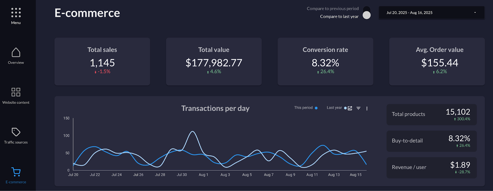
The example from Data Studio Guru’s Full Screen Dashboard reflects these principles well:
- Clear, focused data.
- Sidebar navigation separating dashboard sections.
- An overview page.
- Strong focus on KPI metrics like transactions and revenue.
- Well-spaced elements with good contrast.
(One limitation: there’s no commentary included, which is acceptable for dashboards but not ideal for a final report.)
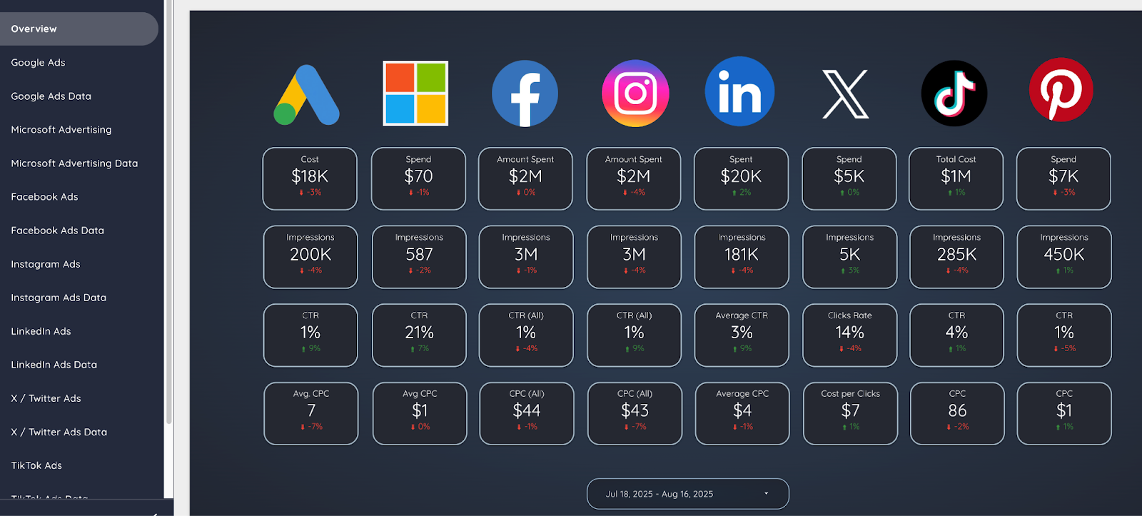
Michael Howe-Ely’s Ultimate Ads Dashboard is another strong example, featuring:
- An excellent summary page combining all ad platforms side by side.
- In-depth platform pages for deeper dives.
- Sidebar navigation.
Dig deeper: How to deliver PPC results to executives: Get out of the weeds
Insight
The second guiding principle is insight.
While the dashboards above don’t include commentary, a great report must go beyond presenting data to providing insight.
A strong report should include:
- Data: Present charts and tables in a clear, simplified format.
- Observation: Summarize what happened in the data.
- Interpretation: Explain why it happened.
- Action: Recommend what to do next based on this understanding.
This progression from data to action is what makes insights truly actionable.
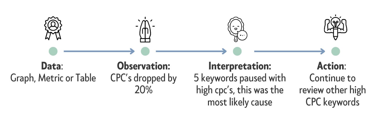
Each page should focus on a single concept or KPI and include no more than three key insights that follow the four-step process above.
AI can help automate parts of this, especially generating observations, but it’s not yet strong at interpretation.
Dig deeper: How to analyze PPC performance metrics
Get the newsletter search marketers rely on.
See terms.
Context
The third guiding principle is context. Without it, data exists in a vacuum.
A great report must provide context to make metrics meaningful. There are two key types of context to include:
- Historical performance.
- Industry benchmarks.
Historical performance shows whether results are improving over time.
Show both month-over-month (MoM) and year-over-year (YoY) changes in your graphs.
YoY comparisons are especially useful for seasonal businesses because they compare performance to the same time last year.
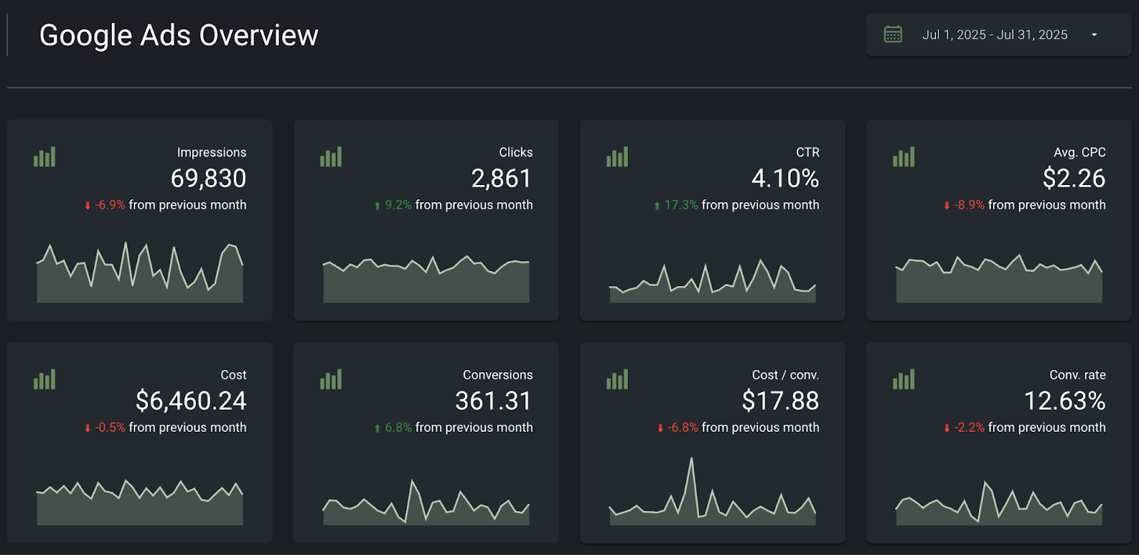
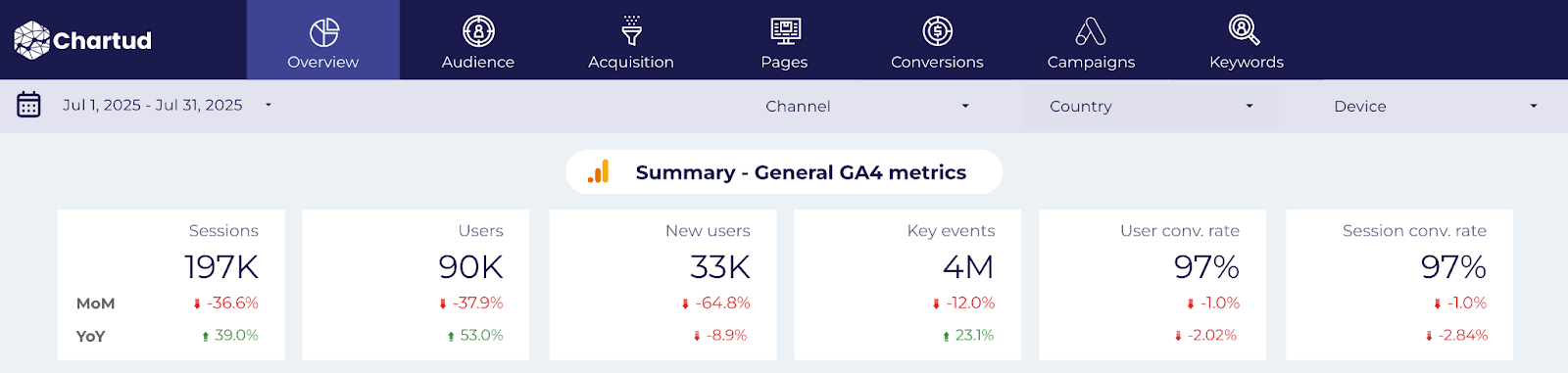
In the report below, KPIs show both MoM and YoY deltas to clearly signal changes over time:
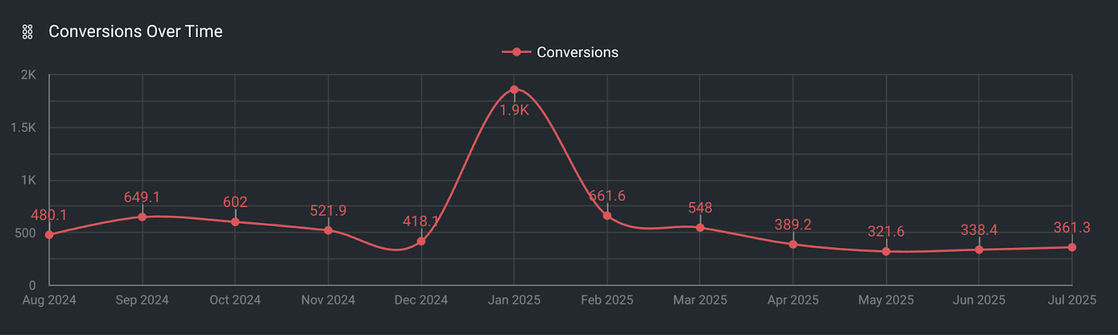
Graphs on a timeline add even more detail by showing multiple time periods.
In the graph below, the conversion metric is tracked over 12 months:
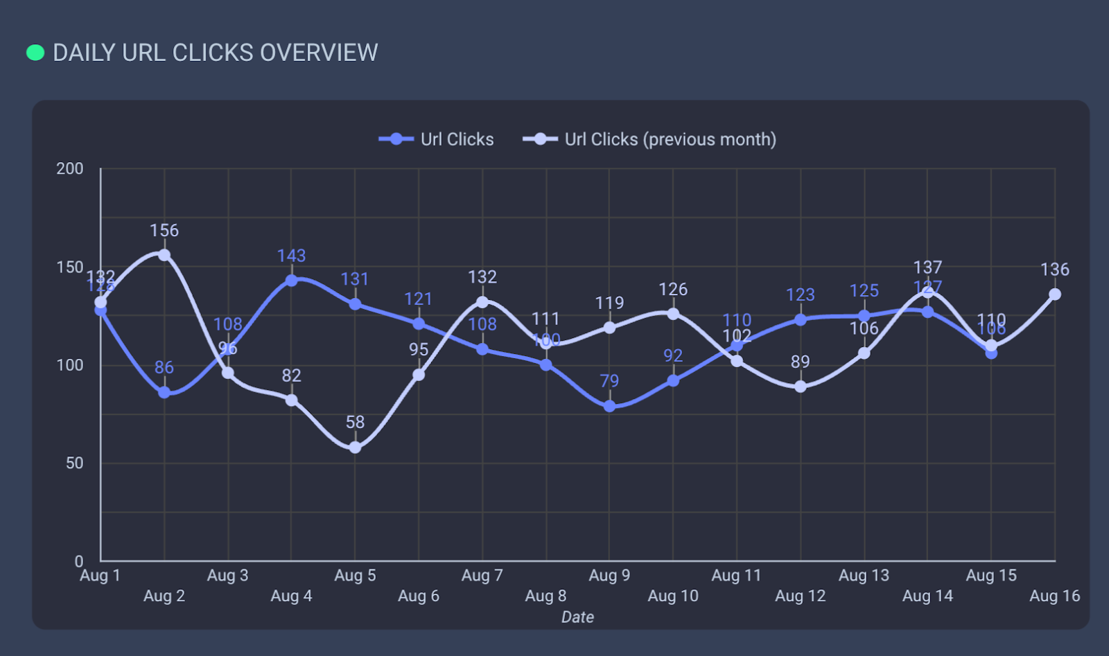
Compare two distinct time-period curves on one graph to make changes easy to spot.
For example, the chart below shows URL clicks on the blue curve vs. URL clicks from the previous month on the light blue curve:
Industry benchmarks add another layer of context.
Clients may say it’s great that conversions are increasing or cost per acquisition is decreasing, but how does that compare to competitors? Reliable sources include:
- Google Keyword CPC data: Compare keyword CPCs with competitor CPCs using Google’s keyword tool.
- Wordstream benchmarks: Wordstream aggregates and publishes key metrics such as conversion rates across industries in the U.S.
Combining historical performance with industry benchmarks gives clients a clearer, more meaningful picture of results.
Dig deeper: How to produce a better PPC QBR for your stakeholders
Your roadmap to effective PPC reporting
Getting started with reporting is easier than ever.
Many tools and templates let you build reports quickly.
Google’s Looker Studio is a strong starting point, with plenty of plug-and-play templates available from Google and third-party marketplaces like byMarketers.
These can get you up and running in minutes.
No matter which tools or software you choose, anchor every report in the three key principles of simplicity, insight, and context.
Dig deeper: Agency-grade PPC audits: How to turn reports into growth roadmaps


Recent Comments